Color is particularly plastic in electronic media. However, the facility of change and speed of manipulation are not substitutes for a deeper understanding of the grace and harmony necessary to use color to convey expression.
Although the exact experience of color is may differ from person to person, computer to computer, room to room, and light source to light source, the value of color as an expressive tool is obvious. The meaning with which we imbue color is as complicated as language itself. Color is a universal carrier of visual and sensual experience. Color is language.
Theories of color come from such areas as physics, optics, psychology, and even pathology. While this text primarily explores the visual components of color—for they are the most salient and cyber design is primarily visual—we should be mindful that all metafora are conditioned by an expression of color. James Baldwin (American writer and civil rights activist, 1924-87) knew that a writer can use inflection in language in the same way that a designer uses hue: to add an element of expression and contrast to words, as musical composers use tone to complement rhythm in creating a mood.
To communicate effectively, the participants in any dialog must understand the changing connotations of color. The computer's schematics have have been developed in the Western world, and so its programmers, designers, and editors must attempt to understand the varied connotations attached to each color as they change from culture to culture.
In the digital realm, we have the opportunity to generate a unique set of cultural metaphors and values. In digital operations, no color is permanent: colors can be shifted as logically and illogically as the creator's fantasies. The sky can be purple one minute and red the next, or vary for different users in the same space. Although these changes are all too often arbitrary, this random use of color may itself constitute a new aesthetic, the new norm. What will be next year's new black?
But not when it ripens in a tumour;
And healing greens, leaves and grass,
so Springlike,
In limbs that fester are no springlike.
- Dannie Abse, Pathology of Colors
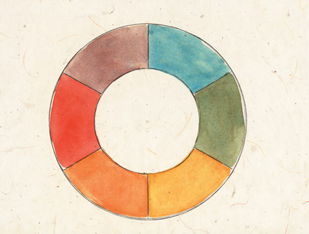
Study of color perception shows that most cultures have eleven basic color categories, although they may only have terms for as few as two colors. These basic color categories are white, black, red, yellow, blue, purple, orange, green, brown, pink, and gray. Knowing that we all perceive the same basic colors would indicate that color perception is biological. The visible spectrum has no demarcations in it; the way we divide it is arbitrary, and so cultures create these boundaries which are culturally unique.

Letty Oratowski, Color Wheel, 2002
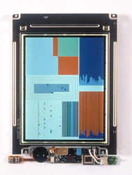
Artists, designers, and other users have been liberated now that colors can be literally pulled out of thin air without resorting to complicated mathematical formulas or the fumes of a printmaking studio. As computer-generated color began to enter the designer's workflow in the mid-1990s, the world saw objects created in an entirely new palette, such as those of the Apple iMac computer, which quickly influenced everything from lamps to automobiles.
The expressive value of color is perhaps nowhere better demonstrated than in automobile design, particularly the Volkswagen Beetles of the early twenty-first century, whose vibrant color palette is certainly influenced by electronic color design. The "hyper" colors of the electronic circuit have become ubiquitous in global culture. Electric-green baseball caps are as familiar in the streets of Japan as they are in the villages of Mexico.
The creativity of design lies in the management of color. It is a powerful signifier that is always loaded with meaning; its use cannot be arbitrary because these meanings inflect metafora. Like pitch or volume of sound, too much or too little color can make or break the effectiveness of the work.
- James Baldwin, Collected Essays

